Overview
The overview page provides a customizable summary of application performance over time. Use it as a health monitor or a starting point for a deeper investigation.
The visualizations and metrics show what's running slowly, what can be improved, and user satisfaction.
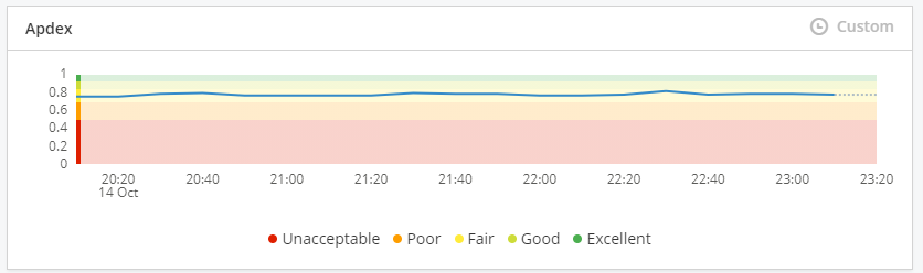
Apdex
Application Performance Index (Apdex) is an open standard that benchmarks user experience and allows you to identify poor user experience. The five bands of application responsiveness are color coded to make it easier to identify trends, with a grey dotted line indicating any missing data points.
Unacceptable: 0.00 - 0.49 (red) users will notice unacceptable performance and may abandon the process.
Poor: 0.50 - 0.69 (orange) users will notice moderate performance lagging.
Fair: 0.70 - 0.84 (yellow) users will notice some performance lagging.
Good: 0.85 - 0.93 (light green) users are generally productive and not impeded by application response time.
Excellent: 0.94 - 1.00 (dark green) users are fully productive and not impeded by application response time.
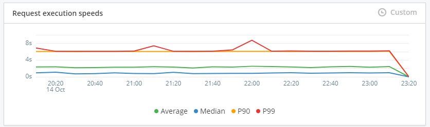
Request execution speeds
The request execution speeds tile shows how fast your app is executing requests from your users. P90 and P99 load time shows the maximum time that 90% or 99% of users have had to wait for your application to load. For example if the P90 is three seconds, then 90% of the requests were handled in three seconds or less.
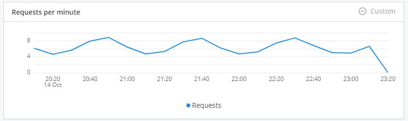
Requests per minute (RPM)
The Requests per minute tile shows how many requests your application receives each minute.
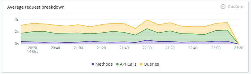
Average request breakdown
The average request breakdown tile shows the trend in response time of queries, methods and API calls.
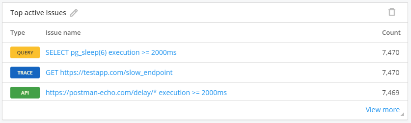
Top active issues
The top active issues tile shows the most common performance issues grouped by the performance rules they violate. Learn more about issues
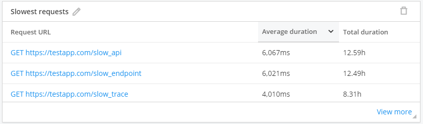
Slowest requests
The slowest requests tile shows requests sorted by average duration in descending order. Use this to find slow requests you can optimize. Learn more about requests
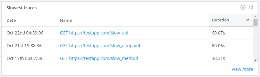
Slowest traces
The slowest traces tile shows traces sorted by duration in descending order. Use this to find slow traces you can optimize. Learn more about traces
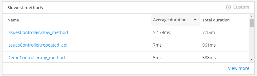
Slowest methods
The slowest methods tile shows methods sorted by average duration in descending order. Use this to find slow methods you can optimize. Learn more about methods
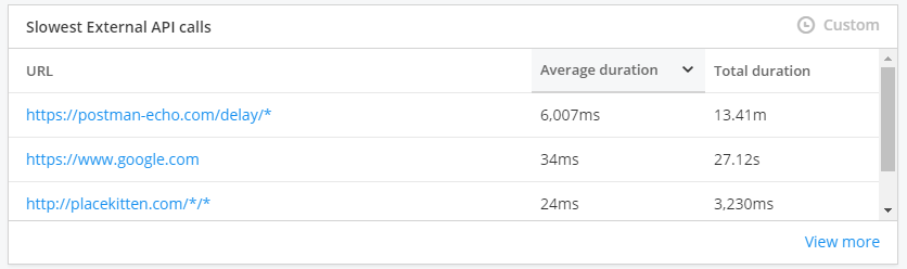
Slowest external API calls
The slowest external API calls tile shows API calls sorted by average duration in descending order. Use this to find slow external API calls you can optimize. Learn more about external API calls
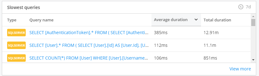
Slowest queries
These are the slowest queries of your app. This list is sorted by average duration in a descending order. This is the place to look for the slowest queries that you can optimize. Learn more about queries
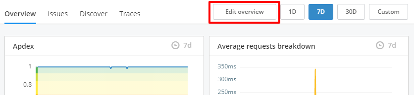
Customising the overview page
Click on the "Edit overview" button to resize, edit, or add more tiles to this page.
Changes to the APM overview page will also be applied to everyone who have access to this app.
These tiles can also be added to your Raygun custom dashboards, so that you can view your APM, error and RUM data all in one place. You can find the APM specific tiles when you add a tile to an existing custom dashboard.